This
rule triggers when PageSpeed Insights detects that you have more than
one redirect from the given url to the final landing page.
Overview
Redirects
trigger an additional HTTP request-response cycle and delay page
rendering. In the best case, each redirect will add a single roundtrip
(HTTP request-response), and in the worst it may result in multiple
additional roundtrips to perform the DNS lookup, TCP handshake, and TLS
negotiation in addition to the additional HTTP request-response cycle.
As a result, you should minimize use of redirects to improve site
performance.
Here are some examples of redirect patterns:
example.com uses responsive web design, no redirects are needed - fast and optimal!
example.com → m.example.com/home - multi-roundtrip penalty for mobile users.
example.com → www.example.com → m.example.com - very slow mobile experience.
Avoid Plugins
This rule triggers when PageSpeed Insights detects the use of plugins on your page.
Overview
Plugins
help the browser process special types of web content, such as Flash,
Silverlight, and Java. Most mobile devices do not support plugins, and
plugins are a leading cause of hangs, crashes, and security incidents in browsers that provide support. Due to these concerns, many desktop browsers restrict plugins:
This
rule triggers when PageSpeed Insights detects that your page does not
specify a viewport, or specifies a viewport that does not adapt to
different devices.
Overview
A viewport controls how a
webpage is displayed on a mobile device. Without a viewport, mobile
devices will render the page at a typical desktop screen width, scaled
to fit the screen. Setting a viewport gives control over the page's
width and scaling on different devices.
Left: A page without a meta viewport. Right: A page with a viewport matching the device width.
Recommendations
Pages optimized to display well on mobile devices should include a meta viewport in the head of the document specifying width=device-width, initial-scale=1.
Hardware pixel: A physical pixel on the display. For example, an iPhone 5 has a screen with 640 horizontal hardware pixels.
Device-independent pixel (dip): A scaling of device pixels to match a uniform reference pixel at a normal viewing distance, which should be approximately the same size on all devices. An iPhone 5 is 320 dips wide.
CSS pixel: The unit used for page layout controlled by the viewport. Pixel dimensions in styles such as width: 100px are specified in CSS pixels. The ratio of CSS pixels to device independent pixels is the page's scale factor, or zoom.
Desktop Pages on Mobile Devices
When a page does not specify a viewport, mobile browsers will render that page at a fallback width
ranging from 800 to 1024 CSS pixels. The page scale factor is adjusted
so that the page fits on the display, forcing users to zoom before they
can interact with the page.
Meta Viewport Tag
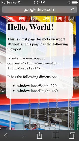
A meta
viewport tag gives the browser instructions on how to control the page's
dimensions and scaling, and should be included in the document's head.
Fixed-Width Viewport
The viewport can be set to a specific width, such as width=320 or width=1024. While discouraged, this can be a useful stopgap to ensure pages with fixed dimensions display as expected.
Responsive Viewport
Using the meta viewport value width=device-width
instructs the page to match the screen's width in device independent
pixels. This allows the page to reflow content to match different screen
sizes.
Some browsers, including iOS and Windows Phone, will keep
the page's width constant when rotating to landscape mode, and zoom
rather than reflow to fill the screen. Adding the attribute initial-scale=1
instructs browsers to establish a 1:1 relationship between CSS pixels
and device independent pixels regardless of device orientation, and
allows the page to take advantage of the full landscape width.
vs Left: An iPhone 5 rotating width=device-width, resulting in a landscape width of 320px. Right: An iPhone 5 rotating width=device-width, initial-scale=1, resulting in a landscape width of 568px.Pages must be designed to work at different widths to use a responsive viewport. See our recommendations for sizing content to the viewport for advice.
Other Considerations
Avoid minimum-scale, maximum-scale, user-scalable
It
is possible to set the minimum and maximum zoom, or disable the user's
ability to zoom the viewport entirely. These options negatively impact
accessibility and should generally be avoided.
@viewport
The
meta viewport tag, while broadly supported, is not part of a formal
standard. This behavior is being included in CSS as part of the CSS Device Adaptation
specification. Until this specification is finalized and widely
implemented, authors should continue to use the meta viewport tag for
compatibility, either alone or with corresponding @viewport styles.
This rule triggers when PageSpeed Insights detects that compressible resources were served without gzip compression.
Overview
All modern browsers support and automatically negotiate gzip compression for all HTTP requests. Enabling gzip
compression can reduce the size of the transferred response by up to
90%, which can significantly reduce the amount of time to download the
resource, reduce data usage for the client, and improve the time to
first render of your pages. See text compression with GZIP to learn more.
Recommendations
Enable and test gzip compression support on your web server. The HTML5 Boilerplate project contains sample configuration files
for all the most popular servers with detailed comments for each
configuration flag and setting: find your favorite server in the list,
look for the gzip section, and confirm that your server is
configured with recommended settings. Alternatively, consult the
documentation for your web server on how to enable compression:
PageSpeed
Insights reports that many of my static content files need to be
gzipped, but I have configured my web server to serve these files using
gzip compression. Why is PageSpeed Insights not recognizing the
compression?
Proxy servers and anti-virus software can disable
compression when files are downloaded to a client machine. PageSpeed
Insights' results are based on headers that were actually returned to
your client, so if you are running the analysis on a client machine that
is using such anti-virus software, or that sits behind an intermediate
proxy server (many proxies are transparent, and you may not even be
aware of a proxy intervening between your client and web server), they
may be the cause of this issue.
To determine if a proxy is the cause, you can use the PageSpeed Insights Chrome extension to examine the headers:
Run PageSpeed on the page in question.
Click the Show Resources tab.
Expand
the URL of the resource that is being flagged as uncompressed. The
headers that accompanied that resource are displayed. If you see a
header called Via, Forwarded, or Proxy-Connection, this indicates that a proxy has served the resource.
Improve Server Response Time
This rule triggers when PageSpeed Insights detects that your server response time is above 200 ms.
Overview
Server
response time measures how long it takes to load the necessary HTML to
begin rendering the page from your server, subtracting out the network
latency between Google and your server. There may be variance from one
run to the next, but the differences should not be too large. In fact,
highly variable server response time may indicate an underlying
performance issue.
Recommendations
You should reduce your
server response time under 200ms. There are dozens of potential factors
which may slow down the response of your server: slow application logic,
slow database queries, slow routing, frameworks, libraries, resource
CPU starvation, or memory starvation. You need to consider all of these
factors to improve your server's response time. The first step to
uncovering why server response time is high is to measure. Then, with
data in hand, consult the appropriate guides for how to address the
problem. Once the issues are resolved, you must continue measuring your
server response times and address any future performance bottlenecks.
Gather and inspect
existing performance and data. If none is available, evaluate using an
automated web application monitoring solution (there are hosted and open
source versions available for most platforms), or add custom
instrumentation.
Identify and fix top
performance bottlenecks. If you are using a popular web framework, or
content management platform, consult the documentation for performance
optimization best practices.
Monitor and alert for any future performance regressions!
Leverage Browser Caching
This
rule triggers when PageSpeed Insights detects that the response from
your server does not include caching headers or if the resources are
specified to be cached for only a short time.
Overview
Fetching
resources over the network is both slow and expensive: the download may
require multiple roundtrips between the client and server, which delays
processing and may block rendering of page content, and also incurs
data costs for the visitor. All server responses should specify a
caching policy to help the client determine if and when it can reuse a
previously fetched response.
Recommendations
Each resource
should specify an explicit caching policy that answers the following
questions: whether the resource can be cached and by whom, for how long,
and if applicable, how it can be efficiently revalidated when the
caching policy expires. When the server returns a response it must
provide the Cache-Control and ETag headers:
Cache-Control
defines how, and for how long the individual response can be cached by
the browser and other intermediate caches. To learn more, see caching with Cache-Control.
ETag
provides a revalidation token that is automatically sent by the browser
to check if the resource has changed since the last time it was
requested. To learn more, see validating cached responses with ETags.
To determine the optimal caching policy for your site, please use the following guides:
We
recommend a minimum cache time of one week and preferably up to one
year for static assets, or assets that change infrequently. If you need
precise control over when resources are invalidated we recommend using a
URL fingerprinting or versioning technique - see invalidating and
updating cached responses link above.
Minify Resources (HTML, CSS, and JavaScript)
This
rules triggers when PageSpeed Insights detects that the size of one of
your resources could be reduced through minification.
Overview
Minification
refers to the process of removing unnecessary or redundant data without
affecting how the resource is processed by the browser - e.g. code
comments and formatting, removing unused code, using shorter variable
and function names, and so on. See preprocessing & context-specific optimizations to learn more.
Recommendations
You should minify your HTML, CSS, and JavaScript resources. For minifying HTML, you can use PageSpeed Insights Chrome Extension
to generate an optimized version of your HTML code. Run the analysis
against your HTML page and browse to the 'Minify HTML' rule. Click on
'See optimized content' to get the optimized HTML code. For minifying
CSS, you can try YUI Compressor and cssmin.js. For minifying JavaScript, try the Closure Compiler, JSMin or the YUI Compressor.
You can create a build process that uses these tools to minify and
rename the development files and save them to a production directory.
Optimize Images
This
rule triggers when PageSpeed Insights detects that the images on the
page can be optimized to reduce their filesize without significantly
impacting their visual quality.
Overview
Images often account
for most of the downloaded bytes on a page. As a result, optimizing
images can often yield some of the largest byte savings and performance
improvements: the fewer bytes the browser has to download, the less
competition there is for the client's bandwidth and the faster the
browser can download and render content on the screen.
Recommendations
Finding
the optimal format and optimization strategy for your image assets
requires careful analysis across many dimensions: type of data being
encoded, image format capabilities, quality settings, resolution, and
more. In addition, you need to consider whether some images are best
served in a vector format, if the desired effects can be achieved via
CSS, and how to deliver appropriately scaled assets for each type of
device. To answer these and other questions please follow the image optimization guide on Web Fundamentals. For a quick overview, see the image optimization checklist.
Optimize CSS Delivery
This
rule triggers when PageSpeed Insights detects that a page includes
render blocking external stylesheets, which delay the time to first
render.
Overview
Before the browser can render content it must
process all the style and layout information for the current page. As a
result, the browser will block rendering until external stylesheets are
downloaded and processed, which may require multiple roundtrips and
delay the time to first render. See render-tree construction, layout, and paint to learn more about the critical rendering path, and render blocking CSS for tips on how to unblock rendering and improve CSS delivery.
Recommendations
If
the external CSS resources are small, you can insert those directly
into the HTML document, which is called inlining. Inlining small CSS in
this way allows the browser to proceed with rendering the page. Keep in
mind if the CSS file is large, completely inlining the CSS may cause
PageSpeed Insights to warn that the above-the-fold portion of your page
is too large via Prioritize Visible Content.
In the case of a large CSS file, you will need to identify and inline
the CSS necessary for rendering the above-the-fold content and defer
loading the remaining styles until after the above-the-fold content.
The critical styles
needed to style the above-the-fold content are inlined and applied to
the document immediately. The full small.css is loaded after initial
painting of the page. Its styles are applied to the page once it
finishes loading, without blocking the initial render of the critical
content.
Note that the web platform will soon support loading
stylesheets in a non-render-blocking manner, without having to resort to
using JavaScript, using HTML Imports.
Don't inline large data URIs
Be
careful when inlining data URIs in CSS files. While selective use of
small data URIs in your CSS may make sense, inlining large data URIs can
cause the size of your above-the-fold CSS to be larger, which will slow
down page render time.
Don't inline CSS attributes
Inlining CSS attributes on HTML elements (e.g., <p style=...>)
should be avoided where possible, as this often leads to unnecessary
code duplication. Further, inline CSS on HTML elements is blocked by
default with Content Security Policy (CSP).
Reduce the size of the above-the-fold content
This
rule triggers when PageSpeed Insights detects that additional network
round trips are required to render the above the fold content of the
page.
Overview
If the amount of data required exceeds the
initial congestion window (typically 14.6kB compressed), it will require
additional round trips between your server and the user’s browser. For
users on networks with high latencies such as mobile networks this can
cause significant delays to page loading.
Recommendations
To
make pages load faster, limit the size of the data (HTML markup,
images, CSS, JavaScript) that is needed to render the above-the-fold
content of your page. There are several ways to do this:
Structure your HTML to load the critical, above-the-fold content first
Load
the main content of your page first. Structure your page so the initial
response from your server sends the data necessary to render the
critical part of the page immediately and defer the rest. This may mean
that you must split your CSS into two parts: an inline part that is
responsible for styling the ATF portion of the content, and the part
that can be deferred.
Consider the following examples of how a site could be restructured to load faster:
If your HTML loads third-party widgets before it loads the main content, change the order to load the main content first.
If
your site uses a two-column design with a navigation sidebar and an
article, but your HTML loads the sidebar before the article, consider
loading the article first.
Reduce the amount of data used by your resources
Once
your site has been redesigned to work well across multiple devices and
load the critical content first, use the following techniques to reduce
the amount of data required to render your page:
Minify Resources:
HTML, CSS, and JavaScript can be minified by removing unnecessary
whitespace and comments. Further optimizations may be possible through
the use of tools which rename variable names in your resources.
This
rule triggers when PageSpeed Insights detects that your HTML references
a blocking external JavaScript file in the above-the-fold portion of
your page.
Overview
Before the browser can render a page it
has to build the DOM tree by parsing the HTML markup. During this
process, whenever the parser encounters a script it has to stop and
execute it before it can continue parsing the HTML. In the case of an
external script the parser is also forced to wait for the resource to
download, which may incur one or more network roundtrips and delay the
time to first render of the page. See Adding Interactivity with JavaScript to learn more about how JavaScript affects the critical rendering path.
Recommendations
You
should avoid and minimize the use of blocking JavaScript, especially
external scripts that must be fetched before they can be executed.
Scripts that are necessary to render page content can be inlined to
avoid extra network requests, however the inlined content needs to be
small and must execute quickly to deliver good performance. Scripts that
are not critical to initial render should be made asynchronous or
deferred until after the first render. Please keep in mind that for this
to improve your loading time, you must also optimize CSS delivery.
Inline JavaScript
External
blocking scripts force the browser to wait for the JavaScript to be
fetched, which may add one or more network roundtrips before the page
can be rendered. If the external scripts are small, you can inline their
contents directly into the HTML document and avoid the network request
latency. For example, if the HTML document looks like this:
<html><head><scripttype="text/javascript">/* contents of a small JavaScript file */</script></head><body><div>
Hello, world!
</div></body></html>
Inlining the script contents eliminates the external request for small.js
and allows the browser to deliver a faster time to first render.
However, note that inlining also increases the size of the HTML document
and that the same script contents may need to be inlined across
multiple pages. As a result, you should only inline small scripts to
deliver best performance.
Make JavaScript Asynchronous
By
default JavaScript blocks DOM construction and thus delays the time to
first render. To prevent JavaScript from blocking the parser we
recommend using the HTML async attribute on external scripts. For example:
<script async src="my.js">
See Parser Blocking vs. Asynchronous JavaScript
to learn more about asynchronous scripts. Note that asynchronous
scripts are not guaranteed to execute in specified order and should not
use document.write. Scripts that depend on execution order
or need to access or modify the DOM or CSSOM of the page may need to be
rewritten to account for these constraints.
Defer loading of JavaScript
The
loading and execution of scripts that are not necessary for the initial
page render may be deferred until after the initial render or other
critical parts of the page have finished loading. Doing so can help
reduce resource contention and improve performance.
FAQ
What if I am using a JavaScript library such as jQuery?
Many
JavaScript libraries, such as JQuery, are used to enhance the page to
add additional interactivity, animations, and other effects. However,
many of these behaviors can be safely added after the above-the-fold
content is rendered. Investigate making such JavaScript asynchronous or
defer its loading.
What if I'm using a JavaScript framework to construct the page?
If
the content of the page is constructed by client-side JavaScript, then
you should investigate inlining the relevant JavaScript modules to avoid
extra network roundtrips. Similarly, leveraging server-side rendering
can significantly improve first page load performance: render JavaScript
templates on the server to deliver fast first render, and then use
client-side templating once the page is loaded. For more information on
server-side rendering, see http://youtu.be/VKTWdaupft0?t=14m28s.
Size Content to Viewport
This
rule triggers when PageSpeed Insights detects that the page content
does not fit horizontally within the specified viewport size, thus
forcing the user to pan horizontally to view all the content.
Overview
On
both desktop and mobile devices, users are used to scrolling websites
vertically but not horizontally, and forcing the user to scroll
horizontally or to zoom out in order to see the whole page results in a
poor user experience.
When developing a mobile site with a meta viewport tag,
it easy to accidentally create page content that doesn't quite fit
within the specified viewport. For example, an image that is displayed
at a width wider than the viewport can cause the viewport to scroll
horizontally. You should adjust this content to fit within the width of
the viewport, so that the user does not need to scroll horizontally.
Recommendations
Since
screen dimensions vary widely between devices (e.g. between phones and
tablets, and even between different phones), you should configure the viewport
so that your pages render correctly on many different devices. However,
since the width (in CSS pixels) of the viewport may vary, your page
content should not rely on a particular viewport width to render well.
Avoid setting large absolute CSS widths for page elements (such as div{width:360px;}),
since this may cause the element to be too wide for the viewport on a
narrower device (e.g. a device with a width of 320 CSS pixels, such as
an iPhone). Instead, consider using relative width values, such as width:100%.
Similarly, beware of using large absolute positioning values that may
cause the element to fall outside the viewport on small screens.
If necessary, CSS media queries can be used to apply different styling for small and large screens. This Web Fundamentals article provides further recommendations on how to go about this.
For images, this article provides a nice overview on how to serve responsively-sized images without incurring unnecessary page reflows during rendering.
Size Tap Targets Appropriately
This
rule triggers when PageSpeed Insights detects that certain tap targets
(e.g. buttons, links, or form fields) may be too small or too close
together for a user to easily tap on a touchscreen.
Overview
Small
or tightly packed links or buttons are more difficult for users to
accurately press on a touchscreen than with a traditional mouse cursor.
To prevent users from being frustrated by accidentally hitting the wrong
ones, tap targets should be made sufficiently large and far from other
tap targets that a user can press them without their finger pad
overlapping any other tap targets. The average adult finger pad size is
about 10mm wide (a bit less than half an inch), and the Android UI guidelines recommend a minimum tap target size of roughly 7mm, or 48 CSS pixels on a site with a properly-set mobile viewport.
Recommendations
You
should ensure that the most important tap targets on your site—the ones
users will be using the most often—are large enough to be easy to
press, at least 48 CSS pixels tall/wide (assuming you have configured your viewport
properly). Less frequently-used links can be smaller, but should still
have spacing between them and other links, so that a 10mm finger pad
would not accidentally press both links at once. Users should not have
to pinch zoom (or rely on other browser UI features for disambiguating
finger taps, such as Chrome's popup magnifying glass) in order to easily
and reliably press the desired button or link. Make important tap targets large enough to be easy to press
This
applies to the tap targets your users will use the most, such as
buttons for frequently-used actions, search bars and other important
form fields, and primary navigational links. These tap targets should be
at least 7mm (48 CSS pixels if you have configured your viewport properly), and should have additional spacing around them if they are any smaller than 7mm. Ensure there is extra spacing between smaller tap targets
It
is reasonable for infrequently-used links or buttons to be smaller than
the recommended size of 7mm, but there should still be no other tap
targets within 5mm (32 CSS pixels), both horizontally and vertically, so
that a user's finger pressing on one tap target will not inadvertently
touch another tap target.
Size Tap Targets Appropriately
This
rule triggers when PageSpeed Insights detects that certain tap targets
(e.g. buttons, links, or form fields) may be too small or too close
together for a user to easily tap on a touchscreen.
Overview
Small
or tightly packed links or buttons are more difficult for users to
accurately press on a touchscreen than with a traditional mouse cursor.
To prevent users from being frustrated by accidentally hitting the wrong
ones, tap targets should be made sufficiently large and far from other
tap targets that a user can press them without their finger pad
overlapping any other tap targets. The average adult finger pad size is
about 10mm wide (a bit less than half an inch), and the Android UI guidelines recommend a minimum tap target size of roughly 7mm, or 48 CSS pixels on a site with a properly-set mobile viewport.
Recommendations
You
should ensure that the most important tap targets on your site—the ones
users will be using the most often—are large enough to be easy to
press, at least 48 CSS pixels tall/wide (assuming you have configured your viewport
properly). Less frequently-used links can be smaller, but should still
have spacing between them and other links, so that a 10mm finger pad
would not accidentally press both links at once. Users should not have
to pinch zoom (or rely on other browser UI features for disambiguating
finger taps, such as Chrome's popup magnifying glass) in order to easily
and reliably press the desired button or link. Make important tap targets large enough to be easy to press
This
applies to the tap targets your users will use the most, such as
buttons for frequently-used actions, search bars and other important
form fields, and primary navigational links. These tap targets should be
at least 7mm (48 CSS pixels if you have configured your viewport properly), and should have additional spacing around them if they are any smaller than 7mm. Ensure there is extra spacing between smaller tap targets
It
is reasonable for infrequently-used links or buttons to be smaller than
the recommended size of 7mm, but there should still be no other tap
targets within 5mm (32 CSS pixels), both horizontally and vertically, so
that a user's finger pressing on one tap target will not inadvertently
touch another tap target.
Use Legible Font Sizes
This rule triggers when PageSpeed Insights detects that text in the page is too small to be legible.
Overview
Web font size can be specified via four common units: pixels (px), points (pt), EMs (em), and percent (%).
Pixels are “CSS pixels” and vary based on device size and density.
Points are defined in relation to pixels. A single pixel is 0.75 points*.
EMs
and percent are “relative” units: they are relative to the inherited
size and properties of the font being used. 1 EM is equivalent to 100%.
* See additional notes.
Additionally, the viewport
impacts how fonts are scaled on mobile devices. A page without a
properly configured viewport is scaled down on mobile devices, often
resulting in the text on the page being illegible due to its small size.
Recommendations
First, configure a viewport
to make sure fonts will be scaled as expected across various devices.
Once you've configured a viewport, implement the additional
recommendations below.
Use a base font size of 16 CSS pixels. Adjust the size as needed based on properties of the font being used.
Use sizes relative to the base size to define the typographic scale.
Text
needs vertical space between its characters and may need to be adjusted
for each font. The general recommendation is to use the browser default
line-height of 1.2em.
Restrict the number of fonts used and the
typographic scale: too many fonts and font sizes lead to messy and
overly complex page layouts.
For example, the following CSS
snippet defines a baseline font size of 16 CSS pixels, with CSS class
'small' that has a font size of 75% the baseline font (12 CSS pixels),
and CSS class 'large' that has a font size of 125% the baseline font (20
CSS pixels):
body {
  font-size: 16px;
}

.small {
  font-size: 12px; /* 75% of the baseline */
}

.large {
  font-size: 20px; /* 125% of the baseline */
}
The CSS 2.1 specification
requires careful reading to understand how length units are defined. It
contains further units not mentioned here: inches, centimeters,
millimeters, and picas. What is easy to miss is that a CSS inch is not
always equal to a physical inch.
All absolute units are defined in
relation to each other. 1 pixel is .75 points; 1 point is 1/72nd of an
inch; 1 inch is 2.54 centimeters; etc. However, it is up to the device
to decide how to "anchor" these units. For instance, when printing on
paper, 1 inch is anchored at 1 physical inch, and all other units should
be relative to the physical inch. When displayed on a mobile phone,
however, devices anchor with what is known as the "reference pixel". 1
CSS pixel is defined according to this reference pixel, and all other
units - inches, centimeters, etc - are adjusted relative to the CSS
pixel. Therefore, on a mobile phone, 1 CSS inch is typically displayed
at a size smaller than 1 real, physical inch.
We recommend
defining your font sizes using pixels for this reason. Some designers
and developers may be misled when seeing inches or points used — they
are physical dimensions but do not necessarily correspond to their
real-world sizes. A pixel can always be thought to change size according
to the device it is being displayed on.
Finally, each font also
has its own characteristics: size, spacing, and so on. By default, the
browser will display each font at 16px (CSS pixels). This is a good
default for most cases, but may need to be adjusted for a specific font -
i.e. the default size can be set lower or higher to accommodate for the
different properties of the font. Then, once the default size is set,
larger and smaller fonts should be defined relative to the default size
using pixels. These can then be used to adjust size of the text for
primary, secondary, and other type of content on the page.
Some
mobile browsers may attempt to scale fonts for pages without a properly
configured viewport. This scaling behavior varies between browsers and
should not be relied upon to deliver legible fonts on mobile devices.
PageSpeed Insights displays the text on your page without
browser-specific font scaling applied.


No comments:
Post a Comment